by Ben Parker
Alarm bells are ringing for a food emergency in Ethiopia. The UN says 15 million people will need help over the coming months.
[8 January 2016: Graphic below updated to include November and December satellite imagery].
The government, wary of stigma and therefore hesitant to ask for help, has nevertheless said more than eight million Ethiopians need food assistance.
Extra imports to stem the crisis are already pegged at more than a million tonnes of grain, beyond the government’s means. Inevitably, comment and media coverage compare the current situation with 1984 – the year Ethiopia’s notorious famine hit the headlines. Reports suggest this is the worst drought in 30 years. One declares it a “code red” drought. So how bad actually is it?
The country of close to 100 million people is huge, spread over an area of more than a million square kilometres that ranges from semi-desert to swamp to mountain ranges and fertile farmland. The weather systems and agricultural patterns are diverse and complex. Even within the higher-altitude areas of the country, the most densely populated, the typical rainy seasons vary and crops are grown at different times of the year. This year, the weather has been prone to even greater variation due to the global climate phenomenon El Niño, last seen in 1997-1998.
Ethiopia produces more than 90 percent of its own food. Last year, the cereal harvest was estimated to be 23 million tonnes, but imports in recent years averaged 1.2 million tonnes – just five percent of that. So even if 2015 and 2016 are bad years (the impact of a poor harvest is felt months later as food stocks run out), the vast majority of Ethiopian people will support themselves and eat produce from their own country. But in a giant like Ethiopia, 15 percent of the population is 15 million people – more than the entire humanitarian caseload of the Syrian crisis. An extra five percent of cereals is another 1.2 million tonnes.The costs and logistics become formidable at this scale.
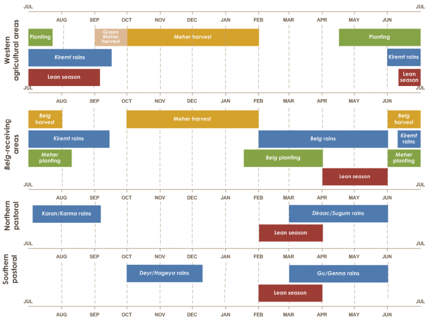
Weather
The weather is only one part of the equation in whether people go hungry. Politics, economics, the availability of seeds and fertiliser, conflict, trade and labour markets, population pressure, social habits, and a host of other factors matter too.
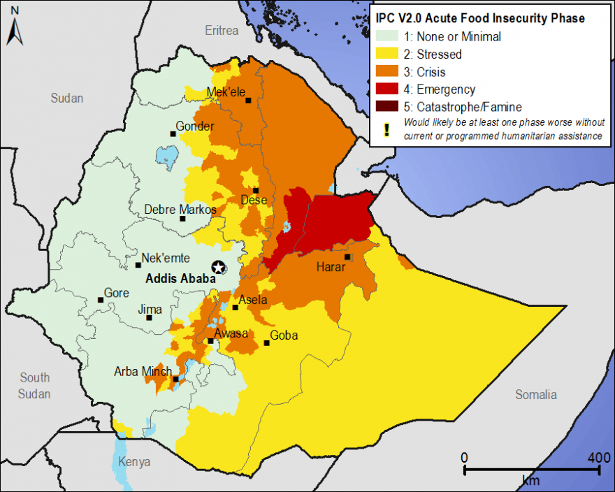
While the science and sociology of food security is complex and layered, international agencies working on drought and hunger-prone countries, including Ethiopia, use a scheme called the Integrated Food Security and Humanitarian Phase Classification Framework (IPC) to simplify the mass of underlying data into a five-step scale – from minimal food security pressure to famine. Some parts of northern Ethiopia are already flagged as being in “Phase 4”, one step from the worst category. More are expected to follow, unless sufficient resources can halt the slide.
Even getting a single view of one year’s weather, let alone human interaction with it, is no simple matter.
For more than 30 years, meteorologists have gathered a giant archive of satellite data for Ethiopia. US satellites, in particular METOP-AVHRR, churn out petabytes of data. Triangulating that with other sources, including ground-based measurement, farm assessments, nutrition, and price monitoring provides a rich toolkit to estimate vegetation, rainfall, soil moisture and temperature – ultimately giving an idea of food on the table.
Considering all the variables, the drought and famine watchdog FEWS NET, established in the wake of the 1984 famine, has used direct, but not alarmist, language to describe the prospects: its latest report for Ethiopia is titled “Large-scale food security emergency projected for 2016”. The UN’s Food and Agriculture Organization, meanwhile, warned: “food security conditions sharply deteriorated.”
Political sensitivity, donor pressures, logistics, media distortion, inefficiency and scepticism may yet conspire to tip more Ethiopians into “Phase 4.” Even in the best-case scenario, the financial resources will be hard to find – $270m is still needed for 2015 alone, according to UN's emergency aid coordination body, OCHA, and needs are set to rise sharply (the US, the UK and China have pledged relatively early to the response, according to the government).
To illustrate the complexity of weather patterns in Ethiopia and attempt to demonstrate a link with El Niño, IRIN analysed 30 years of satellite imagery to provide some visual evidence of the complex and erratic picture of weather in the Horn of Africa.
Ethiopia vegetation health index 1984 - 2015
(updated January 2016)
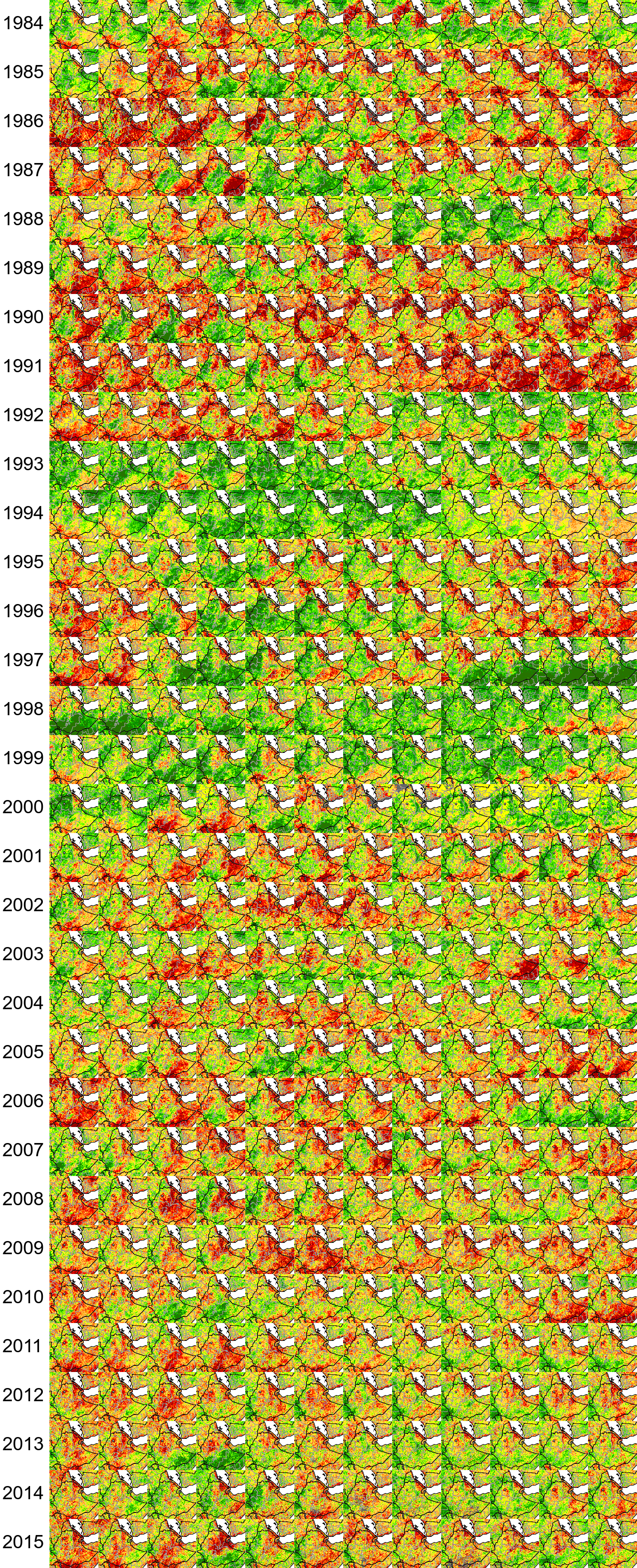
Data: FAO
Above: a snapshot of just one of the datasets used by FEWS NET and the UN to monitor vegetation health – based on a combination of “greenness” as seen from space, combined with estimates of rainfall and temperature. In this, 1991 stands out as a bad drought year, with 1997 showing the impact of heavy rains in the south – these too associated with El Niño. Each column represents a month, January to December, left to right. Red colours indicate poor vegetation health.
Maps and graphics from FEWS NET
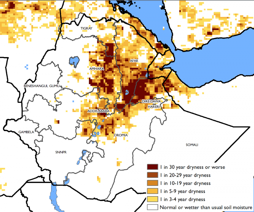
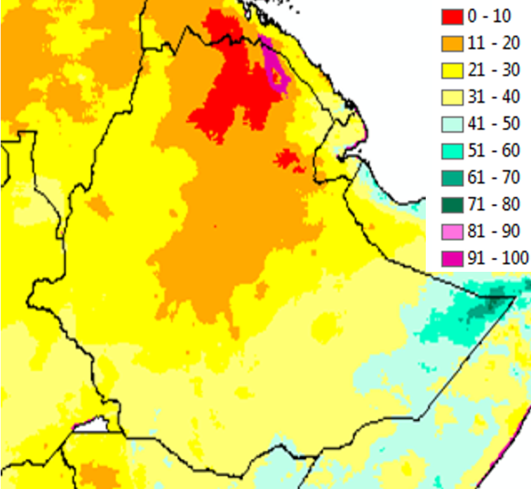
This set of maps and graphics from FEWS NET (see here for details) highlights the range of factors that go into analysing food security. The first shows that localised areas in eastern and northern Ethiopia are as dry as they have been for 30 years – the source of the "worst in 30 years" statements.
Looking for El Niño
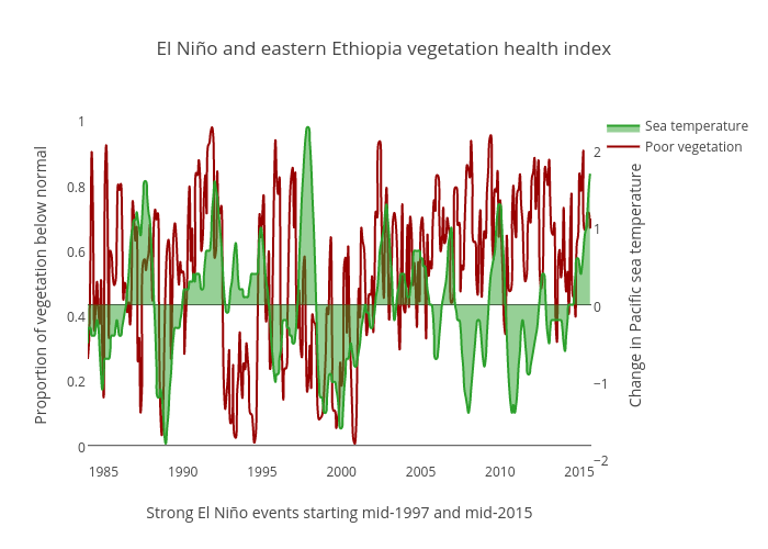
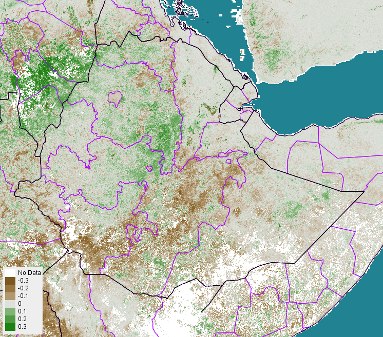
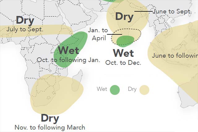
Because El Niño has different effects across the Horn of Africa, the correlation between poor vegetation in Ethiopia and the Pacific sea temperature is not strong when looking at the whole country. Ethiopia straddles areas affected both by dry and wet variations, as this FAO map shows:
Below, we compare the levels of poorer-than-normal vegetation with the temperature changes of the Pacific Ocean - the clues to the El Niño Southern Oscillation.
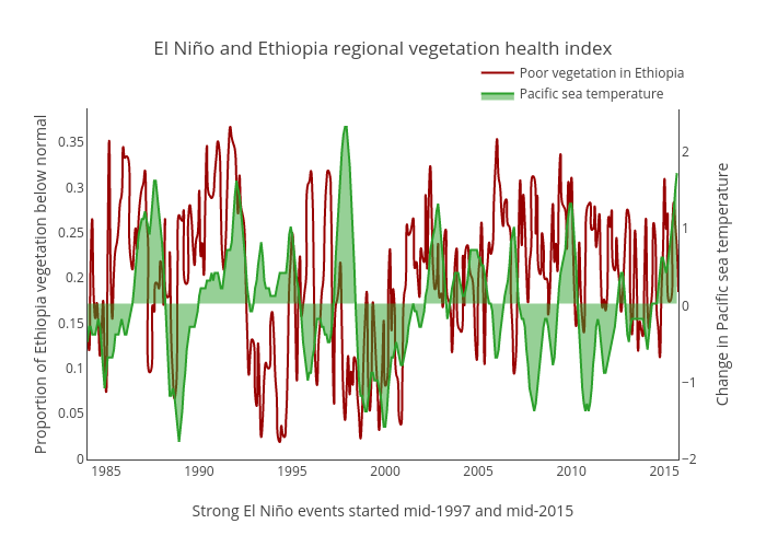

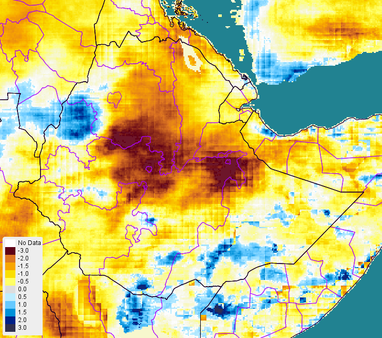
The next graph checks the values in eastern Ethiopia, the worst-affected area this year, by zooming in to this box, with the Djibouti border in the east and Lake Tana in the west. While the severity of the current drought seems on a par with previous events, to the untrained eye it is neither record-breaking nor is a correlation with El Niño so far apparent. However, the Ethiopian Meteorological Agency is forecasting wet weather for the rest of 2015, which might appear to match the 1997 experience (see the rich greens of late 1997 in the graphic above). The peak of the increase in Pacific temperature was around December 1997. The cooling part of the cycle, La Niña, follows.